
Redesigning SeeleTech’s Website
Note: This project is proprietary, so I am only able to share a small snippet of my strategy and design. Thanks for understanding!
PROJECT OVERVIEW
The Problem: The original site was disorganized and confusing, which discouraged users from exploring the website’s content. In addition, the content was incoherent, and functionality didn’t make sense at times.
The Solution: Redesign the website to create user-friendly navigation and organize content for clear understanding of what SeeleTech has to offer.
Tools: Balsamiq (site map and wireframes), OptimalSort (card sorting), Sketch (customer journey map, mockups), Invision (prototyping), and drawing.
PRODUCT HYPOTHESIS
I believe SeeleTech Corporation’s website is disorganized and confusing for viewers. I can help them by redesigning it. I'll know I’m right if traffic to and through the website increases, and the site constantly attracts new viewers.
USER RESEARCH
I interviewed 4 people, who had prior knowledge of blockchain technology so they had a firm grasp of the website’s content. The overall consensus was that the website was muddled, haphazard, and had a lot of typos. The homepage itself had quite a bit of detailed information that could go on different topic-specific pages. There is no “Contact” button or submission form. Instead, the contact email is at the bottom of the page in small print. The overall design of the website was not very appealing or user-friendly. The body text was fairly small and hard to read. A lot of the icons had different styles, so it felt patchy. Overview text and section blurb text were too detailed. These probably would have fit better in the body.
I was fortunate enough to be able to attend a few events and conferences during this time, so I was able to observe a great sample of our targeted audience. Although it wasn’t the conventional ethnographic research, I was able to observe a large sample of typical users, which revealed more details about how the targeted users behave, think, and interact.
Competitive analysis
I researched the websites of three major blockchain and cryptocurrency companies: Ripple, Ethereum, and Bitcoin. Ripple’s website was clear, concise, easy to navigate, and had a modern feel. There are CTAs on each page to contact them or join them. Ethereum’s homepage also had a modern feel and was clear. However, their choice of navigation was a little confusing and, at times, nonexistent. There was no contact information or information about the company/people who created it, which makes sense because Ethereum is an open source platform. Both of these sites have the same format, most likely because both are using Bootstrap or something similar. Bitcoin does provide company information, and the navigation is quite standard and easy to find.
personas
Based off on my research, I created personas to capture the essence of SeeleTech’s users.


Affinity diagramming, Card sorting, and site map
To resolve the organization issue, I did an affinity diagramming exercise to visual what the site will have. I used this information to conduct a closed card sorting exercise, using OptimalSort. I organized the results of the card sorting exercise to determine the organization structure, which I visualized by creating a site map.


customer journey map
To map out the thoughts, emotions, and observations of a potential user, I created a customer journey map using one of the main personas, Marcus.
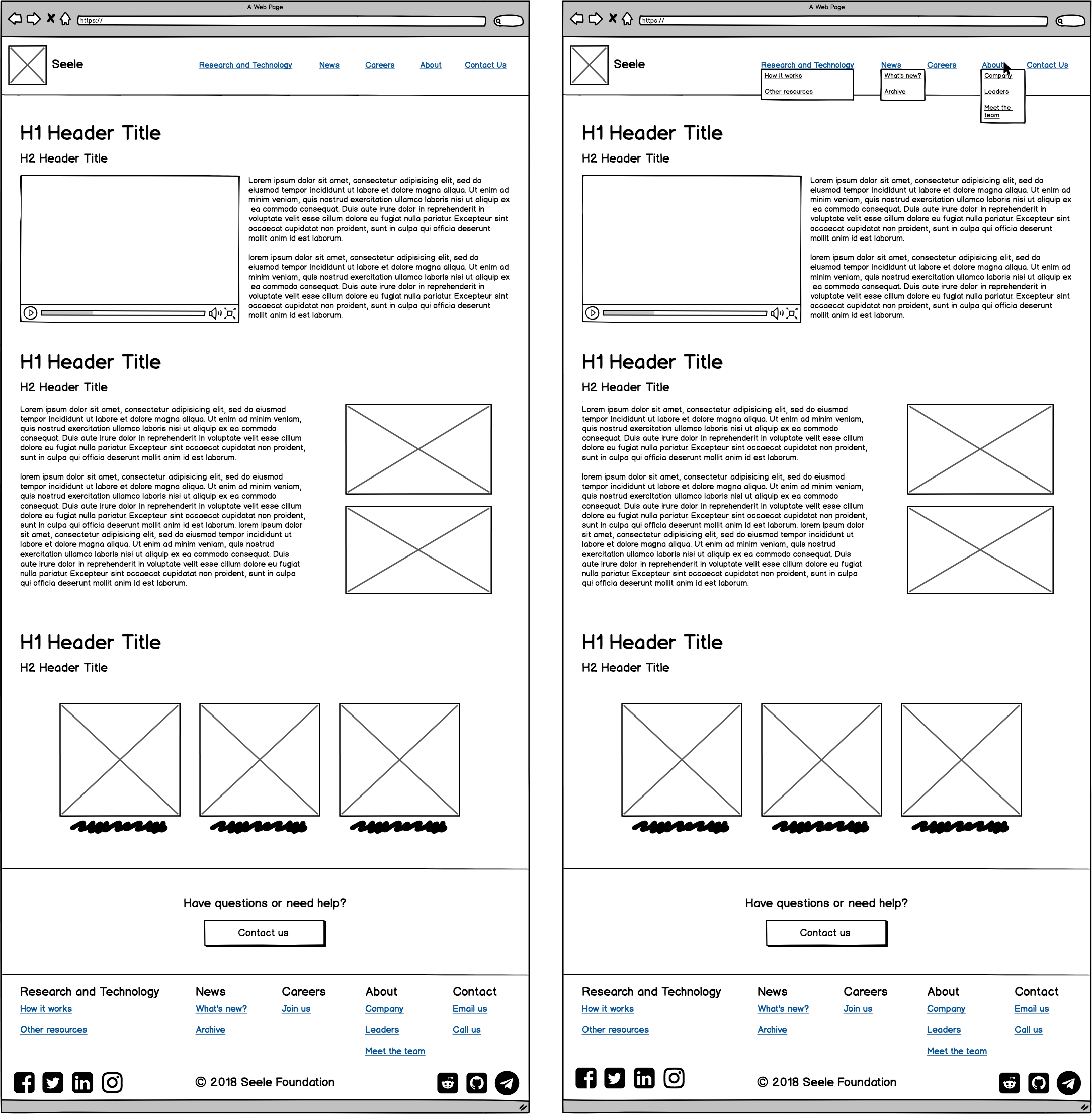
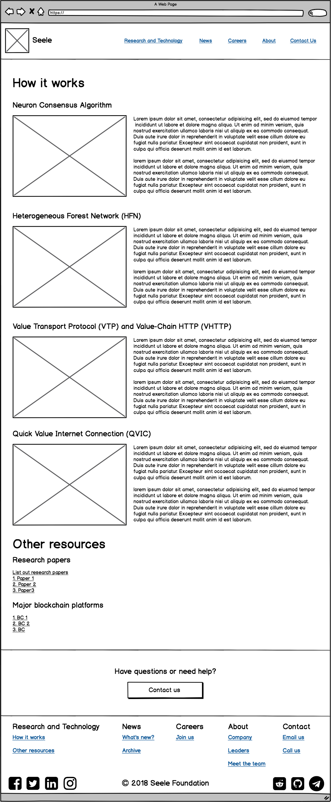
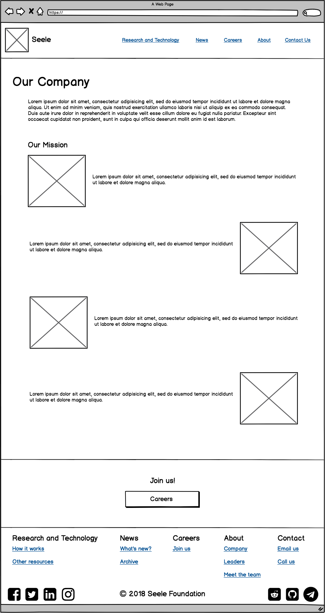
Wireframes
Using research and documentation, I created wireframes in Balsamiq to visualize structure and functionality of the new site. Here are a few wireframes.
user testing
The website received a patched makeover from a third party to help relieve some of the confusion. I used this for the first round of user testing. I had participants go through the website, using different views (desktop, tablet, and mobile). The most noticeable point of confusion was the navigation. Not only was there a navigation bar at the top with a few tabs, but concurrently there also was a menu icon. At first glance, the user thinks there are only four tabs to choose from. Then, the user notices a menu icon that opens up four more options, each with its own subsections. In addition, tabs and links that directed the user to a separate page didn’t open in a new tab, which made navigation back to the website a little inconvenient. On the other hand, styling and design was mostly consistent throughout the site. The content was simplified but obviously targeted a specific audience with previous knowledge. The site is responsive, but there are certain in-between window views that could use some tweaks to make it look more appealing.
Keeping this in mind, I created new mocks to build off of the patched makeover. I kept most of the content, design, and styling the same. The major changes included a different navigation and a couple new pages the stakeholders wanted to include to expand the site. I presented the new navigation to some of the previous participants and some new participants. The previous participants noted that the changed navigation made the site usable, less confusing, and more intentional. The new participants agreed that the navigation was standard, and therefore, easy to use.
Mockups
Using the wireframes as a skeleton and the preliminary user testing results, I fleshed out more details and created high fidelity mockups. I produced about three versions, refining, iterating, and re-testing after each version.
final prototype and lessons learned
I used Invision to produce a clickable prototype to present to a couple of the stakeholders, including the CEO and Director of Operations. They suggested valuable feedback and revealed more in-depth business goals that I incorporated in the final prototype.
Understanding the targeted audience was critical to this project, as well as clear and steady communication with the stakeholders. Several times I had to switch gears or scrap what I was working on due to new or changed goals and priorities. But because I maintained constant communication with the stakeholders, my progress wasn’t setback as bad as I thought. This was a great experience and a great project that I learned a lot from!