
Improving Point of Sale Conversion
The power of ux writing
background
Uplift’s loan product is called Pay Monthly. Users can apply in Uplift’s web application flow, which is integrated into the partner’s website, to see if they qualify for a travel loan.
The data we were collecting suggested our Canadian partners were having more difficulties converting. When we looked deeper into the data, there seemed to be two main areas where users had difficulties continuing to the next step. The first area was actually continuing from step 1 (application form) to step 2 (ESIGN consent). The second area was at the billing step where the user receives the loan offer and sets up payment information.
guiding users to continue
This was a huge problem because if users don’t continue to step 2, there’s zero chance of conversion. After a series of online user testing, we discovered some users just aren’t ready to book; some users have no idea that this is a loan application; and other users are concerned because the application form requests several pieces of personal information plus the legal jargon caused potential confusion.
Therefore, we decided to perform an A/B test. Test A was the control, what was already in production. Test B would be an improved application form to address user concerns.

Test A (control)
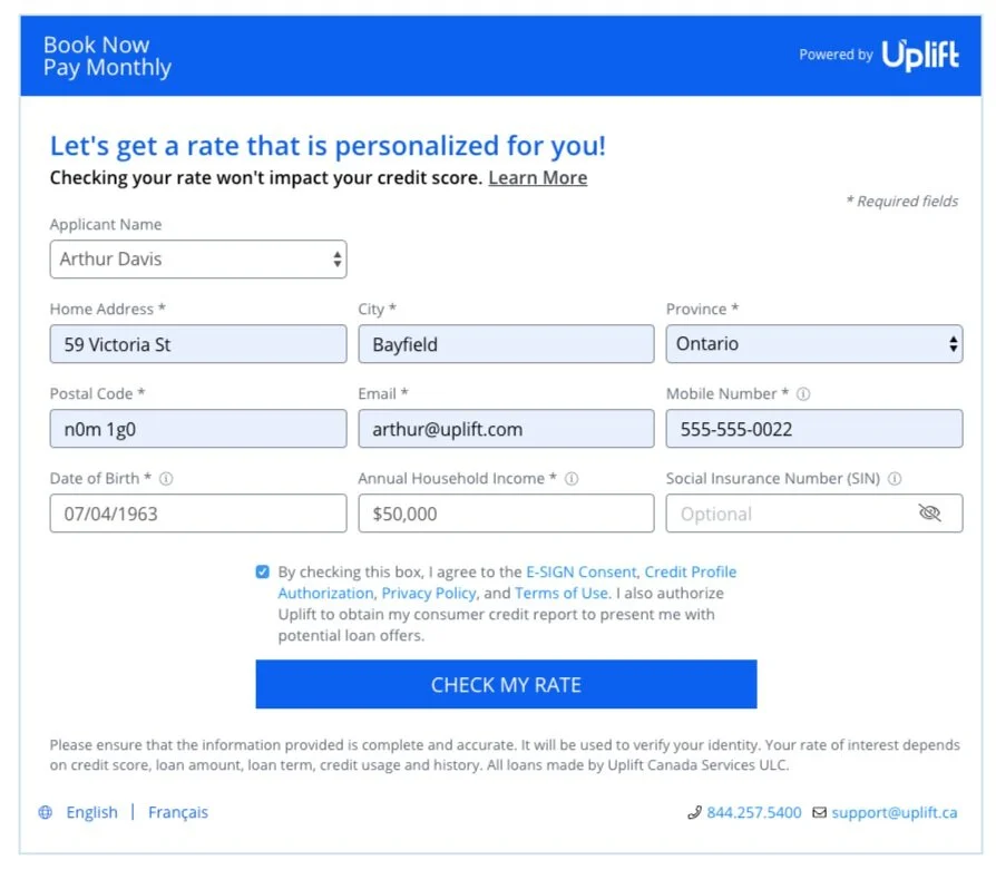
Test B (improved design)
The goals of Test B were to:
Make it more “friendly”, so potential users aren’t scared away or worried about applying.
Provide more information about Uplift Pay Monthly, so users understand that this is a loan application.
Make it easier for users to agree to the appropriate documents to continue with the rest of the application flow.
Goals 1 and 2 were addressed by adding the blue header “Let’s get a rate that is personalized for you!” and the subheader “Checking your rate won’t impact your credit score. Learn more”. The copy in the header was purposefully made more casual with excitement. In addition, specific words/phrases like “rate” and “checking your rate won’t impact your credit score” make it more obvious that this is a loan, but don’t worry, it won’t impact your credit score at this point. “Learn more” triggered a popup that provided more information about the product, Pay Monthly. The checkbox above the CTA addressed Goal 3. Based on the online user testing findings and competitive research, the standard for loan application flows that involve agreeing to documents was a checkbox with the agreement statement or just the agreement statement. To reduce friction and keep the standard that users were accustomed to seeing, the checkbox and accompanying statement was the best course of action.
The A/B test ran for a few weeks. The main takeaway from the data collected was that Test B was well-received. There was a small bump in conversion for Test B. Success!
guiding users to accept
The executives made a business decision a while ago to remove credit cards as a form of payment. To replace the credit card option, we implemented linking bank accounts (ACH/EFT). So the two payment method options are debit card and bank account. After we rolled out ACH/EFT to the Canadian partners and removed credit cards, we saw some drastic drops in conversion at the billing step.
One of the Canadian commercial leads saw the payment methods implemented and notified us that they use different terminology for debit cards, which may have caused confusion and abandonment. Another reason for the drastic drops is because credit cards are a major form of payment, so eliminating a major form of payment will, of course, cause a dip in conversion.
Nonetheless to boost conversion, instead of using “Debit card”, we updated the debit card option to “Visa Debit or Debit Mastercard”. In addition, we added extra copy to provide more guidance on selecting a payment method. After about a month of monitoring and evaluating data, conversion at this step slowly increased. Plus, the number of card errors we received decreased.

Added payment guidance copy and updated payment method terminology.
lessons learned
These two projects reminded me how important content design is in UX design. Just by including a few lines of copy (and displaying it in an easy-to-read format), changing payment method titles, and rethinking competitive standards, conversion increased in both projects. It just shows how critical clear and concise messaging is and how visual/UI design can be a vessel for communication.